Design Engineer — Malmö, Sweden
I design interfaces, then build them.
From Figma to code — nothing lost in translation.
Selected case studies from school, internships, and client work.
I'm a Design Engineer based in Malmö, combining product thinking with hands-on design work. I move naturally between exploration and execution — from shaping early concepts in Figma to building interactive prototypes that bring ideas to life before they're handed over to development.
For me, the process adapts to the problem. Some ideas need structure, others need speed — but all of them benefit from being tested, refined and grounded in a real experience as early as possible.
During my internship at Resurs Bank, this mindset led me into a hybrid role between UX and frontend. Instead of delivering static files, I shared interactive prototypes that made it easier for developers to understand intent, explore design decisions, and give meaningful feedback. It created smoother collaboration, clearer communication and a more thoughtful handoff — where design decisions weren't just visual, but validated through interaction and user experience.
At Resurs Bank, designers handed off static Figma files to developers. Design intent got lost in translation, iterations were slow, and no one owned the space between UX and frontend. The Design Engineer role didn't exist — I stepped into it.
Proposed a faster design-to-code loop: design in Figma, build directly in code using Cursor and Claude, test with real users through Lyssna, iterate. No static handoffs — developers received working prototypes they could test in the browser. Collaborated closely with the frontend team to ship design as code, not as annotated screens.
Design and development happened in parallel instead of sequentially. Misinterpretation dropped because developers interacted with real prototypes. This proved the value of a Design Engineer role at Resurs — someone who ships design as code, not PDFs.

How does the level of interactivity in a Figma prototype affect the quality of insights from user testing? For my thesis at Resurs Bank, I investigated this through the onboarding flow for new credit card customers — focusing on KYC placement, a hidden 48-hour security lock, and confusion between digital and physical cards.
Designed two prototypes with different fidelity levels: a static low-fidelity wireframe (grayscale, minimal interactions) and a fully interactive high-fidelity prototype (realistic visuals, animations, simulated input, brand identity). Conducted a within-subjects study with 6 participants using Think Aloud testing and semi-structured interviews. Analyzed all feedback through thematic analysis — structuring data into themes like engagement, cognitive load, onboarding logic, and feedback clarity.
High-fidelity prototypes created significantly better engagement and deeper insights — users were more active, talkative, and reflective. Critical design issues (misleading labels, unclear buttons, confusing flows) surfaced only in the interactive version. Strong order effect: participants who tested the interactive prototype first lost interest in the static one. Interactivity was essential for evaluating complex journeys involving trust and security.
Concluded that high-fidelity prototypes produce more reliable and valuable user insights, especially in complex flows involving trust, security, or sensitive information. Delivered concrete UX recommendations to Resurs Bank on improving onboarding, communication of security steps, and clarity around digital vs. physical cards.

Resurs Bank's "My Economy" is a financial literacy platform helping users manage budgeting, saving, insurance, and loans. As a school assignment, I conducted a full WCAG accessibility audit — the quality of the work led directly to my internship at Resurs.
Performed a comprehensive gap analysis against WCAG 2.1 AA guidelines. Identified issues including missing alt-tags, insufficient color contrast (yellow/white buttons), a hidden navigation path to MyEconomy, broken tab navigation, and limited video controls. Created wireframes and prototypes for both desktop and mobile with proposed fixes. Ran user tests on Lyssna together with Jasmine from Resurs, using heatmaps to validate improvements.
Delivered a prioritized audit report with actionable recommendations: direct navigation link, separate landing page, language selector (adding English), and pause/play for animations. The work demonstrated real impact on a live product and opened the door to my internship.

Festina was launching a new hybrid smartwatch with a companion app. They needed UX evaluation before going to market — specifically around onboarding, crown navigation, and the Quick Actions menu.
Conducted heuristic evaluation and competitor analysis (vs. Apple Watch). Ran 3 qualitative user interviews testing onboarding, crown navigation, and Quick Actions. Iterated through lo-fi wireframes to hi-fi Figma prototypes across multiple rounds. Key fixes: changed calibration wording from "point straight up" to "point to 12 o'clock", replaced drag-and-drop with plus/minus buttons and an Edit mode, simplified icons, and reordered setup steps for accessibility.
Delivered a professional English-language UX Design Report directly to Festina's development team with actionable recommendations. Analysis grounded in Norman's Action Cycle, Fitts' Law, Hick's Law, and Jacob's Law.

Parkster's parking app had confusing account tier names — "Express", "Neutral", and "Plus" — that didn't communicate value to users. The information architecture had grown organically, making key features hard to discover.
Ran competitor analysis against EasyPark, conducted user interviews and a survey (29 respondents), and created personas. Used card sorting to understand how users group features and pricing tiers. Identified that account naming was the core confusion and proposed renaming tiers to "Bas" and "Pro". Built prototypes focused on converting Express users to Plus accounts.
A restructured information architecture grounded in real user mental models. Clearer tier naming reduced cognitive load and improved the upgrade conversion flow. Reflected on how language and labels shape user perception.

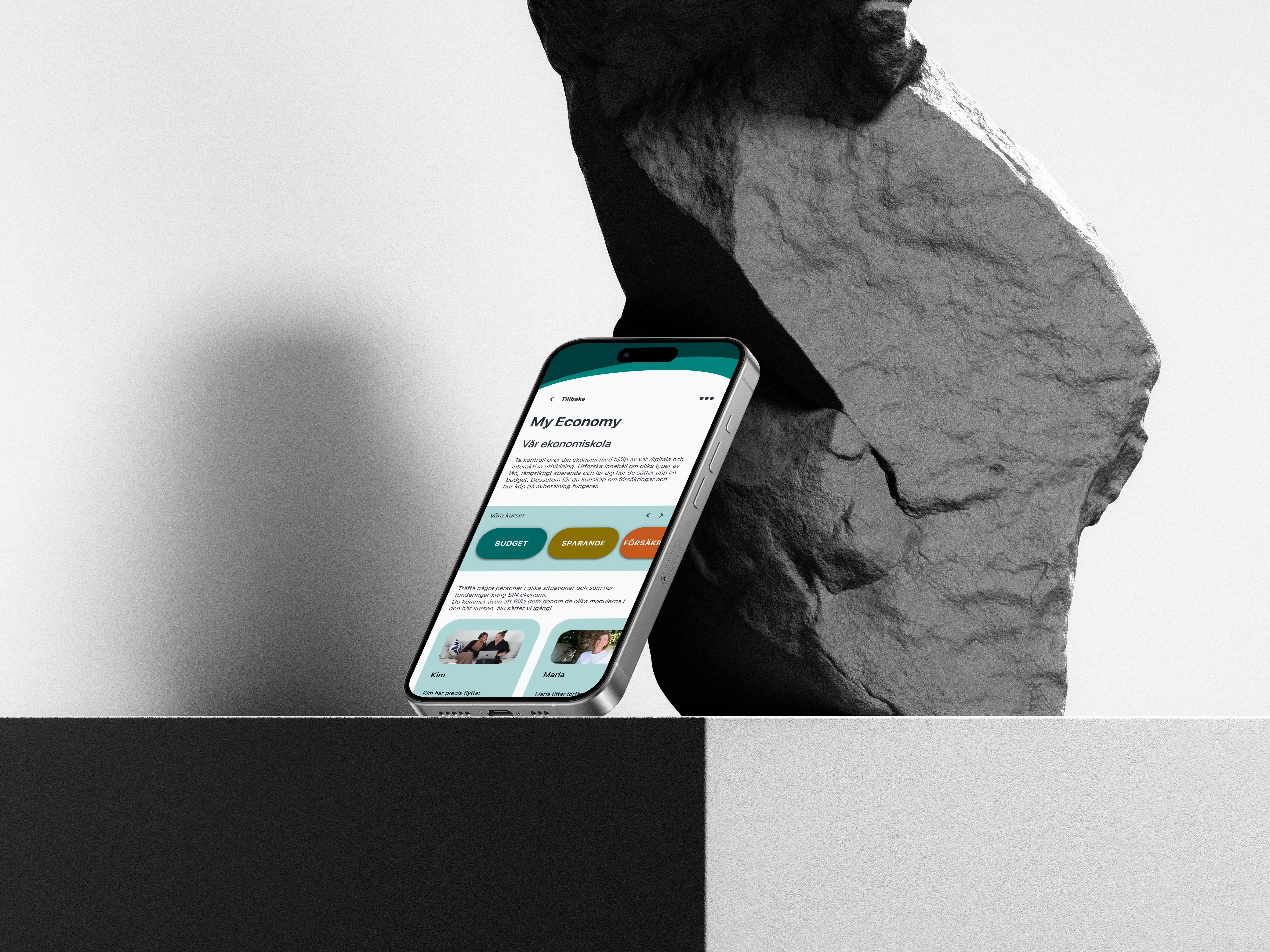
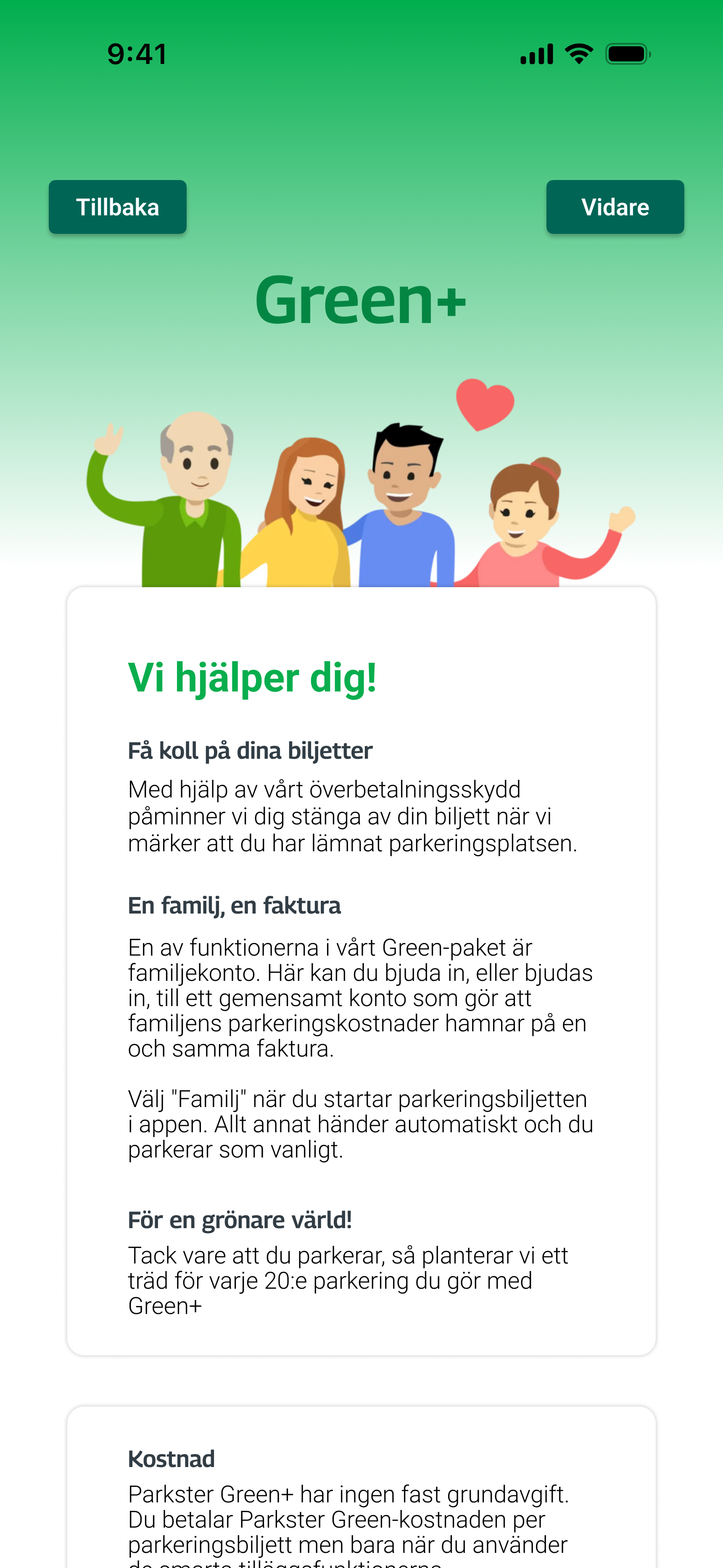
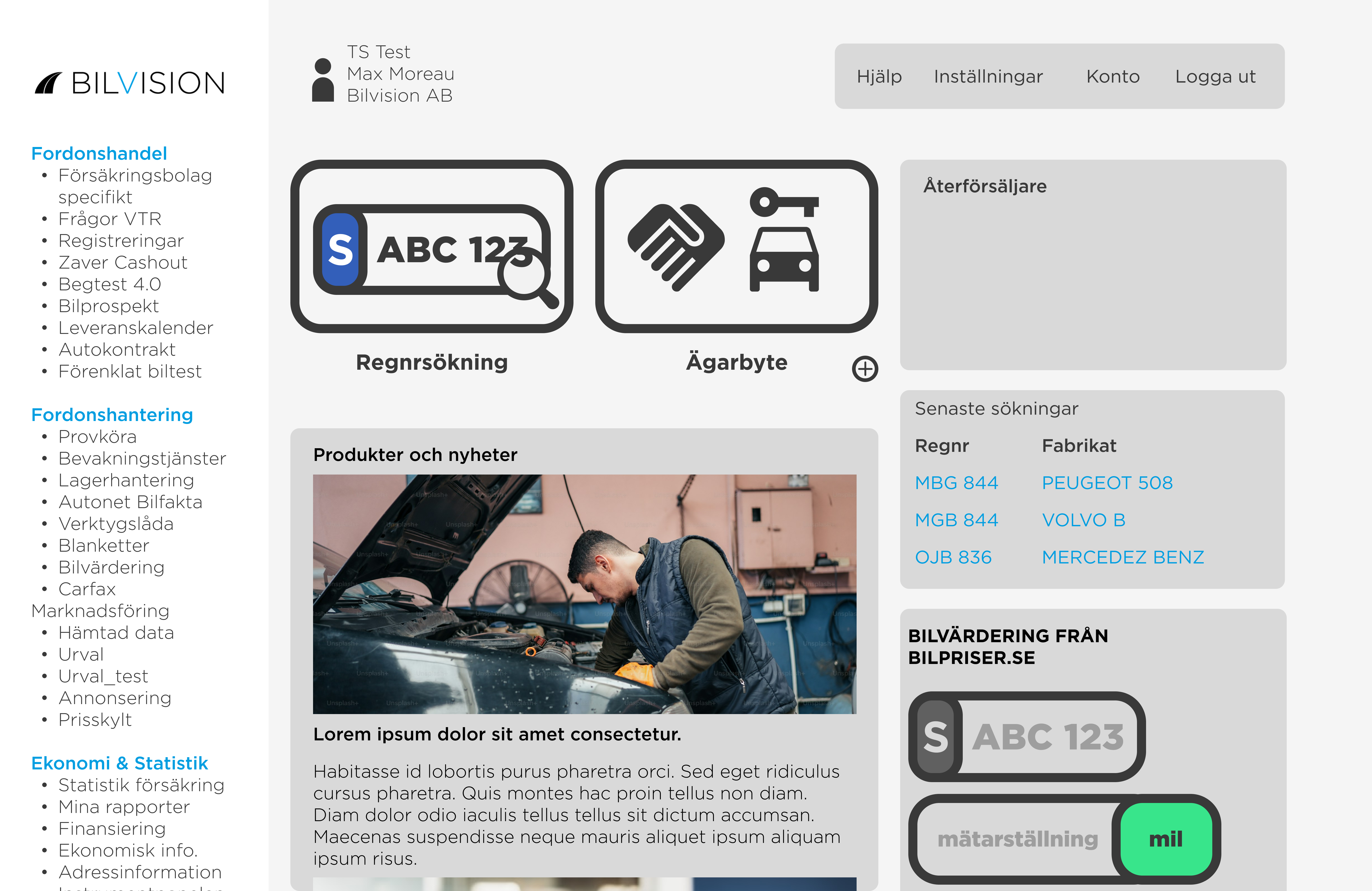
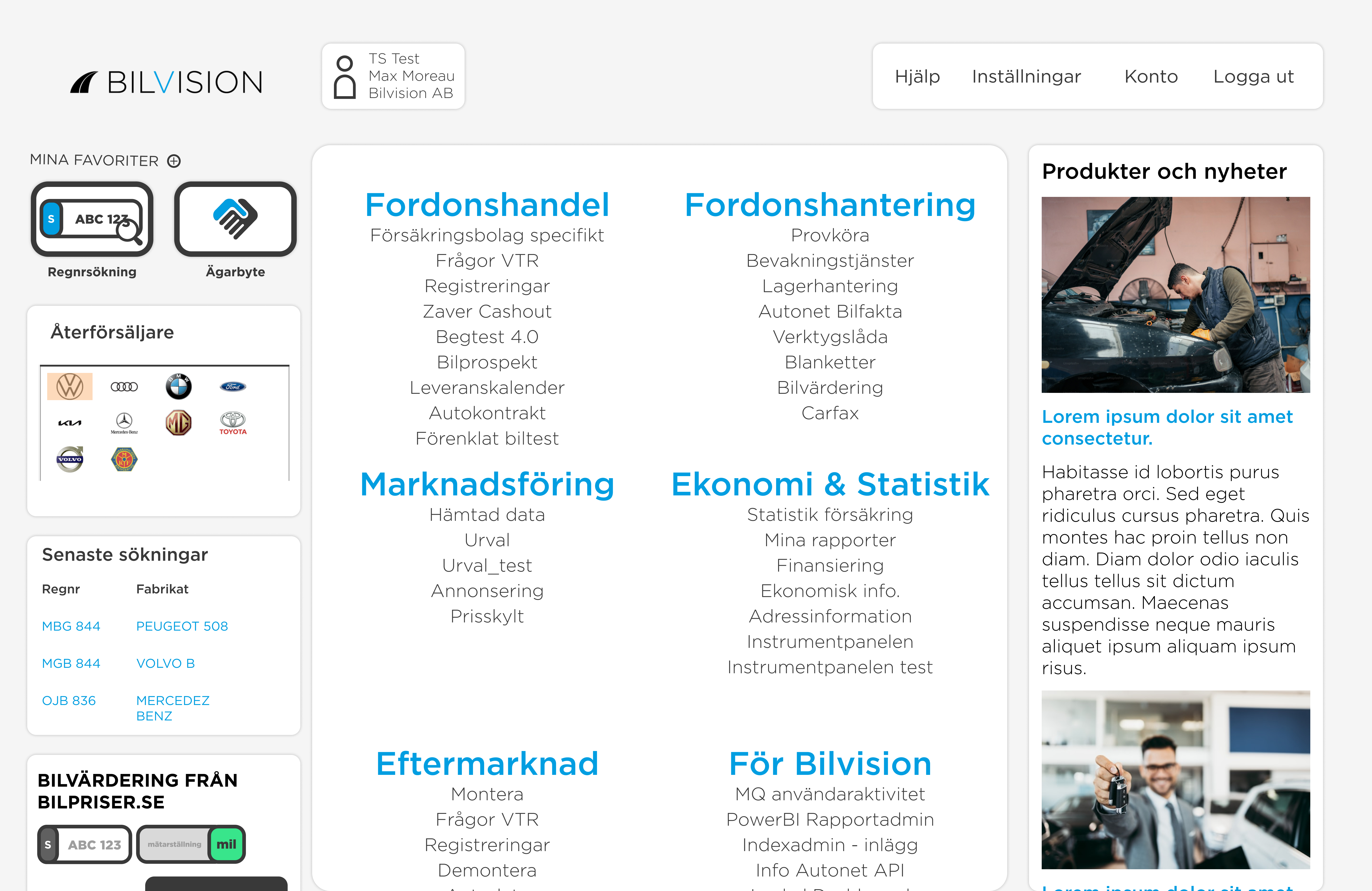
Redesigning Bilvision's vehicle-information portal through iterative prototyping. In this project, I collaborated with Bilvision, a company providing vehicle-information services, to redesign their outdated and difficult-to-navigate customer portal. User issues primarily revolved around two key functions — license-plate lookup and ownership transfer — which accounted for nearly 80% of support tickets. My goal was to create a cleaner, more intuitive homepage and overall experience.
I began with a hands-on evaluation of Bilvision's platform and discovered major pain points: cluttered layout and heavy text, outdated visual design, non-intuitive right-side menu, and important features hidden among irrelevant information. These insights formed the foundation for the redesign.
I worked iteratively through a structured prototyping process to validate layout, flows, and visual direction:
Low-fidelity prototypes (Balsamiq): Quick structure testing without visual distraction.
Wireframes (Figma): Refined grids, spacing, and navigation.
Mid-fidelity prototypes (Figma): Gray-scale layouts with early visual exploration and improved interaction flows.
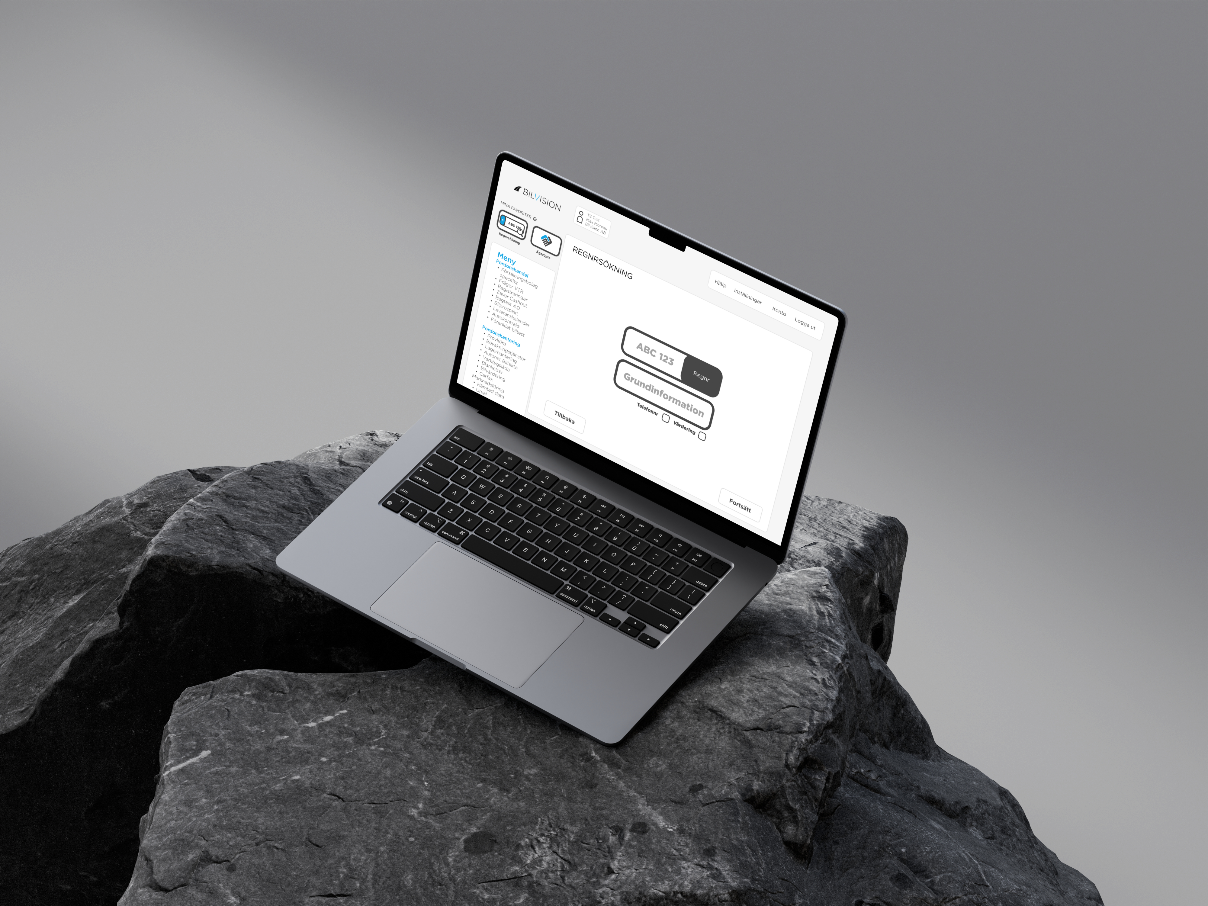
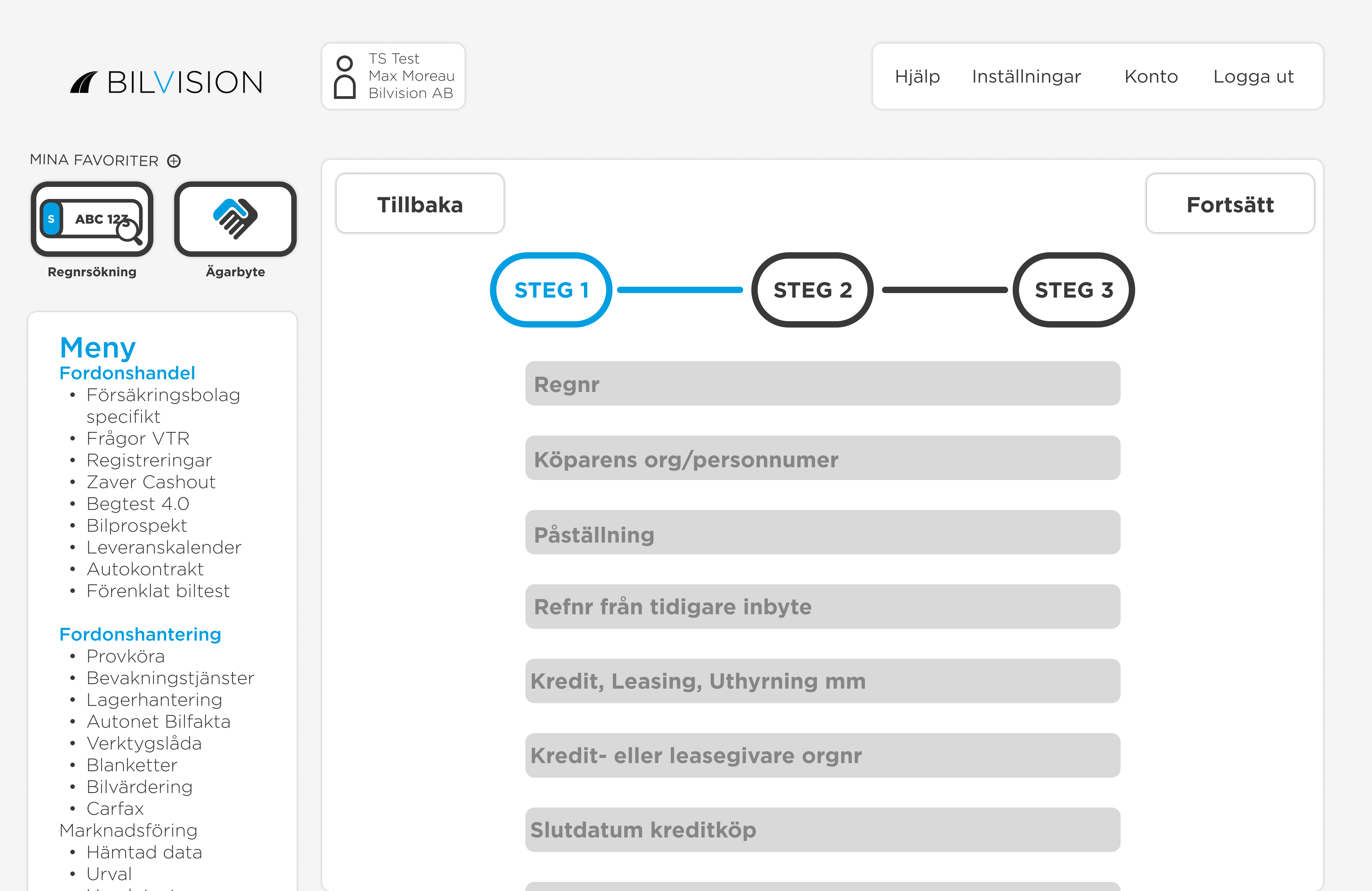
High-fidelity prototypes (Figma): Polished design with colors, typography, icons — used for user testing.
This step-by-step approach ensured each design decision was grounded in user feedback.
The redesign was guided by established UX heuristics:
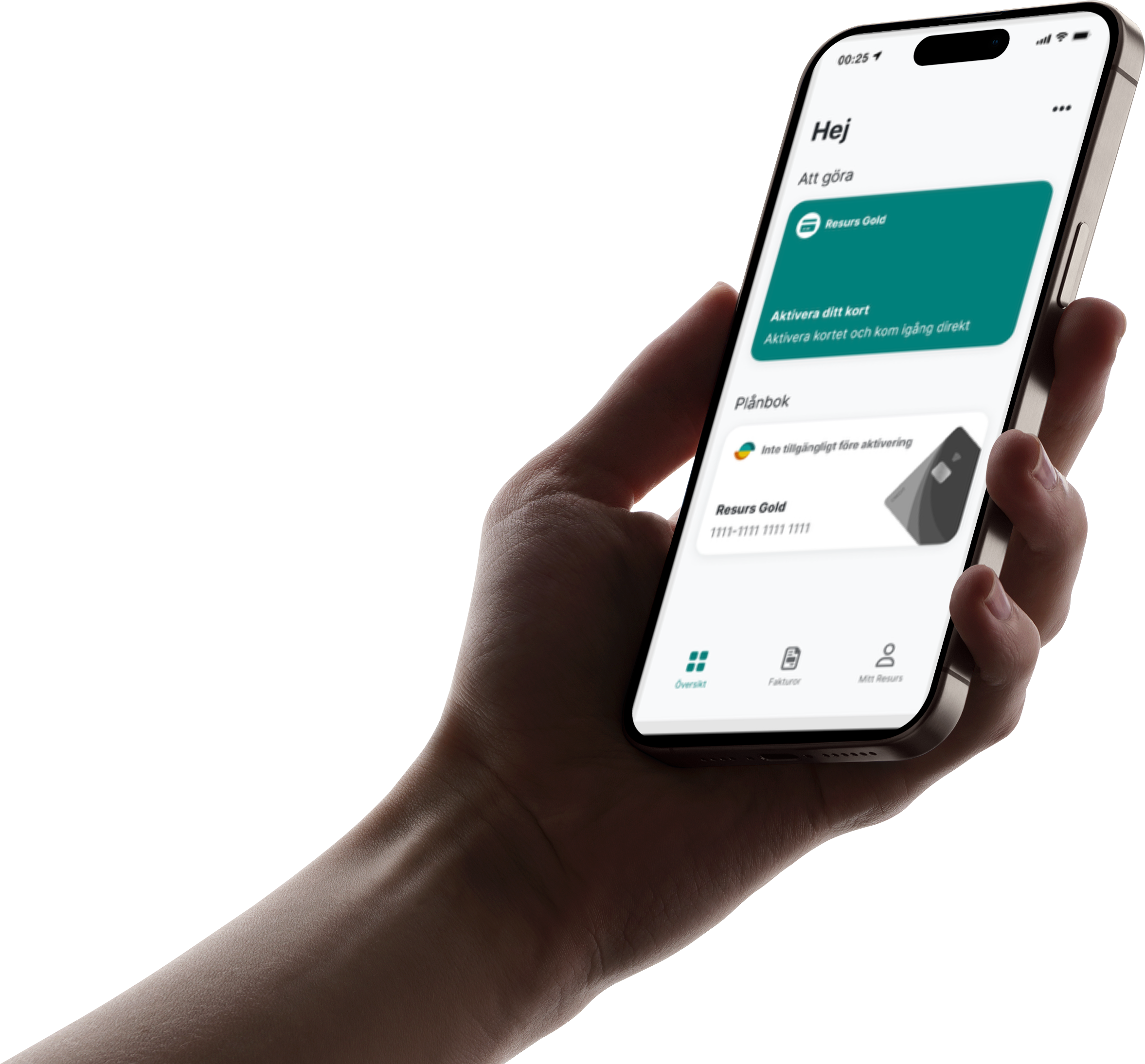
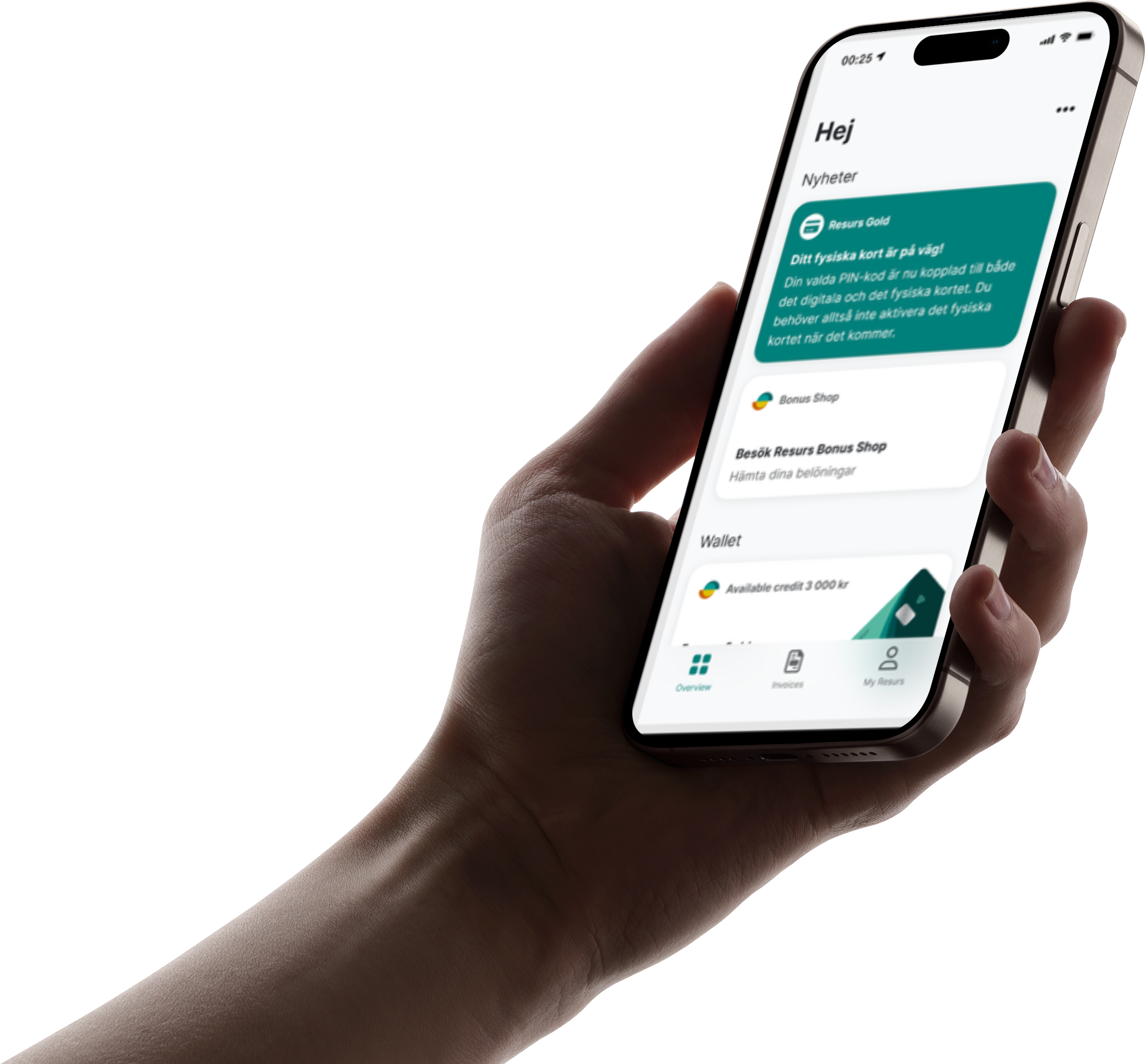
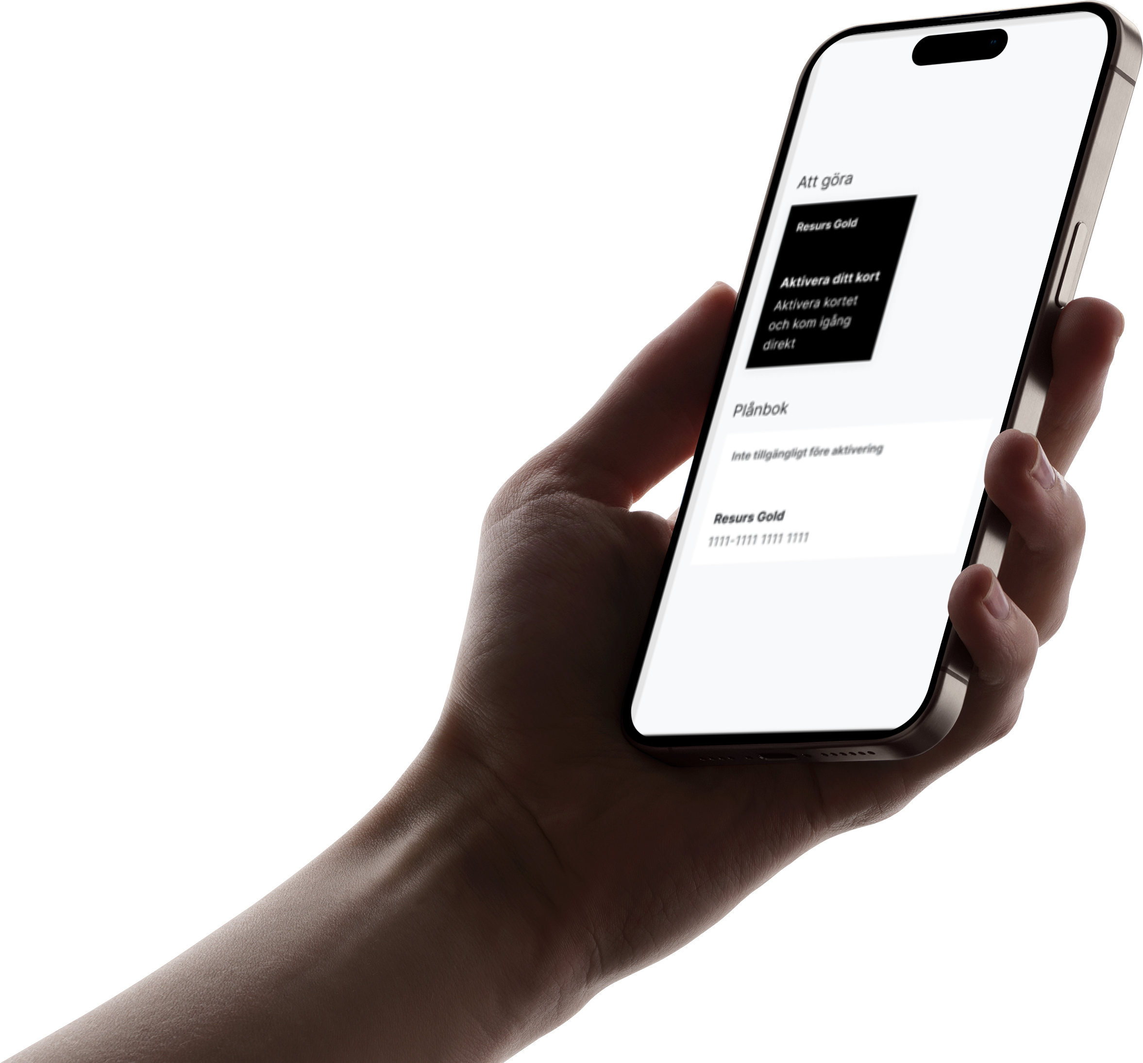
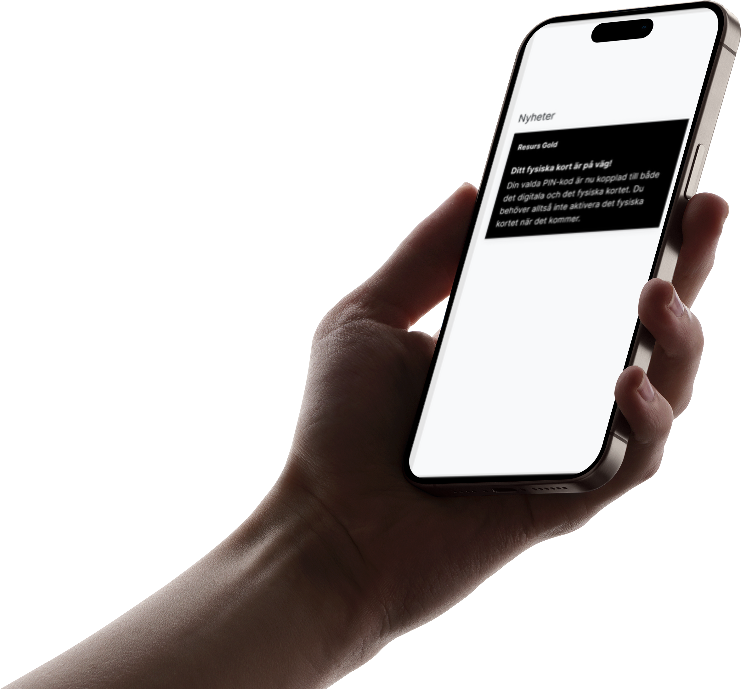
Visibility: Key actions surfaced as large, clear buttons on the homepage.
Consistency: Unified iconography, colors, and type.
User control: Introduced separate scroll areas to reduce confusion.
Feedback: Clear, predictable flows throughout the interface.
I also added a new top navigation bar for Help, Settings, Account and Log Out — something the old portal lacked, which testers greatly appreciated.
Due to confidentiality, all usability testing was done with Bilvision's internal staff: super users (daily users of the portal) and customer-service staff (who handle user support). Testing the high-fidelity prototype provided detailed and practical feedback. Users praised the clearer homepage, easier access to account-related actions, and separate scrolling sections that improved navigation. I implemented final refinements based on their suggestions.
Throughout the project, the interactive prototype acted as a bridge between me, the stakeholder, and internal teams. Weekly meetings with Bilvision allowed continuous alignment, rapid feedback loops, and joint discussion of user needs.
I reflected on and integrated several design dimensions:
Functional: Click-through flows for core tasks
Visual: Modern, clear UI with refined visual hierarchy
Interactive: Local scrolling areas and improved navigation behavior
Content: Realistic labels and example text
Scope: High detail on homepage; lighter detail on secondary pages due to time constraints
The final prototype offered a significantly more intuitive, structured, and modern user experience. It addressed navigation issues, reduced cognitive load, and highlighted key user needs early in the process — saving both time and potential development costs.

In this project, I was tasked by Resurs Bank to understand why young adults prefer competitors like Klarna, Qliro, and Walley — and to design a solution that improves the user experience of Resurs' installment-payment service. The goal was to uncover what motivates users, what challenges they face, and how Resurs can strengthen trust, clarity, and usability.
I explored: why users choose Klarna over Resurs, what needs and frustrations young adults have with payment apps, how important trust, clarity, and support are in the loan process, and how Resurs' flow compares to competitors.
Quantitative survey: I created a Google Forms survey to understand common behaviors, priorities, and pain points. This helped identify recurring themes like unclear fees, fear of missing payments, and frustration with support.
Qualitative interviews: I conducted three in-depth interviews with users representing different financial situations and experience levels. These revealed deeper motivations, frustrations, and expectations around installment services.
Personas & thematic analysis: Based on the interviews, I created personas to represent key user types and ran a thematic analysis identifying four major needs: financial flexibility, clear and simple app design, effective reminders, and trust through reliable customer support.
Using insights from both data sources, I designed a new reminder system inside the Resurs app: users maintain a "100% status" by paying on time, earn a badge each month, and badges unlock benefits like interest discounts on future loans. The design focuses on reducing anxiety around missed payments. I tested this feature iteratively with the interview participants and refined it based on usability feedback.
From surveys and interviews, users consistently expressed: fear of missing payments and wanting clearer reminders, frustration with unclear fees and loan terms, need for better customer support and faster responses, and high value placed on safety and transparency. These became central to my design recommendations.
Insight report summarizing user needs and pain points, personas and user journeys, a gamified reminder-feature prototype, and UX recommendations for increased clarity, trust, and user motivation.
I ensured anonymized survey responses, used a consent form for interviews, and guaranteed that participants could withdraw at any moment.
This project strengthened my ability to combine quantitative and qualitative research, apply thematic analysis, and translate user needs into a feature concept aimed at reducing stress, improving clarity, and increasing user loyalty for Resurs Bank.

For this project, I developed StrollR, a digital service that helps first-time parents find the right stroller based on their lifestyle, needs, and budget. The concept combines UX design, market analysis, business modelling, and storytelling to create a service that is both user-centered and commercially scalable.
I analyzed a target group of first-time parents in Sweden and gathered insights from a survey with over 100 respondents. The research revealed that users feel overwhelmed by too many stroller options, unclear information, and difficulty comparing models. These insights formed the foundation for the service concept.
I evaluated existing solutions such as retailer "test" sites, blog forums, and Facebook groups. Most alternatives lacked personalization and neutrality. This showed a clear market gap for an objective, user-driven recommendation service.
I created the core of StrollR: an interactive quiz that gathers data about lifestyle, home environment, and preferences; personalised stroller recommendations with price comparisons; a neutral platform not tied to any single seller; and a clear, low-stress user experience designed to reduce cognitive load. UX played a central role in shaping the interface, the service logic, and the business strategy.
I created a scalable revenue model built on affiliate links, sponsored content, and contextual advertising. I also explored cost structures, potential conversion rates, and future scalability into other product categories like baby carriers or car seats.
I crafted targeted storytelling for three key audiences: users (a guiding, trustworthy, non-salesy narrative), investors (a data-driven story backed by market size and user pain points), and partners (a narrative about precision targeting rather than mass exposure).
I mapped out goals, actors, impacts, and required deliverables to show how UX drives business value — such as conversion, trust, user satisfaction, and partner engagement.
Through the project, I gained insight into how UX supports the entire business ecosystem — from customer trust and brand identity to long-term scalability and ethical monetization.
StrollR became a fully developed business concept where UX design is integrated into every layer of the strategy. The project demonstrates how user research, storytelling, service design, and business modelling can merge into a cohesive, customer-centered digital product.